Skeuomorphism vs Neumorphism: Which Design Trend Wins in 2026?
You’re booking a flight on your phone. The “Confirm Booking” button looks like a physical button—rounded edges, a soft shadow underneath, and a subtle gradient that mimics light hitting a raised surface. Your finger hovers. It feels clickable before you even touch it.
Now imagine that same button flat on the screen. No shadow. No depth. Just text inside a colored rectangle. Would you trust it the same way?
This instinct—the way we perceive digital elements based on how they mimic or reject the physical world—is at the heart of one of design’s longest-running debates: skeuomorphism vs. neumorphism.
In 2026, after years of flat design dominance, website designers are revisiting these philosophies. Some argue that skeuomorphism design is making a quiet comeback. Others champion neumorphism as the fresh, modern alternative.
So, which design trend wins in 2026? The answer isn’t as simple as picking a side. This guide breaks down the differences, use cases, and future trajectory of each style to help you make informed design decisions.
Which Design Trend Works Best for Businesses in Pakistani Startups?
Pakistani startups face unique challenges: slow internet speeds, diverse user literacy levels, and the need for trust in digital transactions. For local audiences, neumorphism struggles because its low-contrast buttons confuse users unfamiliar with modern UI patterns. Glassmorphism, while beautiful, can increase loading times on budget Android devices common across Pakistan.
The winning choice for most Pakistani startups is functional skeuomorphism with flat design, clean interfaces with subtle shadows and real-world cues (like a clickable “Pay Now” button that looks pressable). This approach reduces user errors, builds trust in e-commerce business checkouts, and works reliably on 3G networks.
Best practice for Pakistani startups:
- Use skeuomorphic depth for primary actions (buy, book, pay)
- Keep all other elements flat for fast loading
- Test on low-end devices before launch
- Avoid neumorphism for critical user flows
When in doubt, follow what leading Pakistani fintech and e-commerce apps are doing: clarity over creativity. A button that looks like a button will always outperform a beautiful button that users don’t recognize.
In 2026, no single design trend wins. Designers use hybrid approaches combining flat design, subtle skeuomorphic depth, and glassmorphism elements for better usability.
What is Skeuomorphism Design?
Skeuomorphism design is a philosophy where digital elements mimic their real-world counterparts. A digital calendar looks like a paper desk calendar. An e-book app displays pages that curl when you turn them. The trash can icon looks like a physical waste bin.
Core Characteristics of Skeuomorphic UI
| Characteristic | Description |
| Realistic textures | Leather, paper, wood, fabric, metal |
| Drop shadows and gradients | Creates depth, making elements look raised |
| Real-world metaphors | Calculator buttons look like physical keys |
| Ornate details | Stitching, stitching, bevels, highlights |
| High visual richness | Often resembles physical objects closely |
Where You’ve Seen Skeuomorphic UI
Apple’s early iOS interfaces (2007-2012) are the most famous examples of skeuomorphic UI. The Notes app looked like a yellow legal pad. The Compass app looked like a physical instrument. The Podcasts app featured a reel-to-reel tape machine.
Even today, skeuomorphism UI design persists in subtle ways:
- The “send” email icon remains an envelope
- The “save” icon is still a floppy disk
- Calendar apps often show page-flip animations
Pros and Cons of Skeuomorphism
| Pros | Cons |
| Intuitive for new users (familiar metaphors) | Can feel dated or cluttered |
| Creates emotional connection through familiarity | Heavy (larger file sizes, slower loading) |
| Reduces learning curve | Difficult to scale across different screen sizes |
| Works well for niche, specialized applications | Can distract from content |
What is Neumorphism?
Neumorphism (also called “soft UI”) emerged around 2019 as a response to years of “flat design” boredom. It sits somewhere between skeuomorphism and flat design, creating elements that blend into the background while appearing slightly raised or depressed.
Core Characteristics of Neumorphism
| Characteristic | Description |
| Monochromatic color schemes | Same color as background (or very close) |
| Two shadows | One dark, one light (simulating lighting from top-left) |
| Subtle contrast | Elements blend in rather than stand out |
| Minimal textures | No gradients, patterns, or realistic details |
| Soft, rounded corners | Friendly, approachable aesthetic |
Where You’ve Seen Neumorphic Design
You’ve likely seen neumorphic logos and interfaces on design blogs, Dribbble, and Behance. Popular examples include:
- Music player interfaces with soft, pill-shaped buttons
- Calculator and timer apps on design portfolios
- Dashboard UI concepts for smart home apps
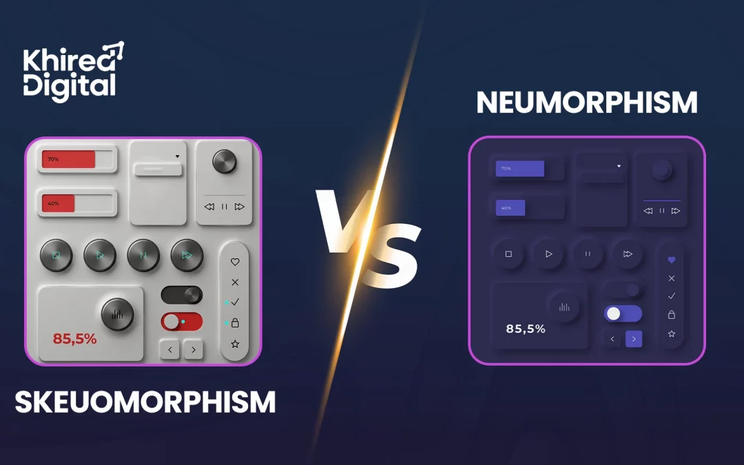
Neumorphic vs Skeuomorphic: Key Visual Difference
| Aspect | Skeuomorphic | Neumorphic |
| Depth | Strong, obvious drop shadows | Soft, subtle shadows |
| Color | Rich, varied, realistic | Monochromatic, muted |
| Texture | Detailed (leather, wood, metal) | None (smooth, matte) |
| Contrast | High (elements pop) | Low (elements blend) |
| Accessibility | Generally good | Poor (low contrast issues) |
Skeuomorphism vs Neumorphism vs Glassmorphism: The Three-Way Comparison
Many designers searching for neumorphism vs skeuomorphism are trying to understand all three major contenders in 2026. Here’s how they stack up.
| Criteria | Skeuomorphism | Neumorphism | Glassmorphism |
| Visual depth | High (realistic) | Medium (soft) | Medium (translucent layers) |
| Color palette | Rich, varied | Monochromatic | Frosted, vibrant backgrounds |
| Accessibility | Good | Poor (low contrast) | Moderate |
| File size/performance | Heavy | Light | Moderate |
| Best for | Niche apps, games, education | Design portfolios, concept UI | Modern SaaS, dashboards, overlays |
| Trend trajectory (2026) | Niche revival | Declining | Growing |
Which Design Trend Wins in 2026?
The honest answer: No single trend “wins.” Instead, designers are adopting a hybrid approach.
The Case for Skeuomorphism (Limited Revival)
Skeuomorphism design is not returning to mainstream UI—but it is finding a new purpose in specific contexts:
- Virtual and augmented reality (realistic metaphors help users navigate unfamiliar digital spaces)
- Educational apps for children (familiar objects reduce cognitive load)
- Niche creative tools (music production apps with realistic knobs, photography apps with classic camera interfaces)
- Gaming and immersive experiences
Pure skeuomorphic UI is too heavy, too slow, and often feels dated for everyday applications. But as a strategic tool for specific user contexts, it has enduring value.
The Case Against Neumorphism (Fading Trend)
Despite its popularity on design showcase platforms, neumorphism faces a critical flaw: accessibility. The low contrast between UI elements and backgrounds makes it difficult for users with visual impairments to distinguish interactive elements.
Major tech companies have largely avoided neumorphism in production products for this reason. While neumorphic logos and concept interfaces remain popular on Dribbble, real-world adoption remains minimal.
For 2026, neumorphism serves best as:
- Inspiration for micro-interactions (soft hover states, subtle press effects)
- Design portfolio pieces (showcasing aesthetic sensibility)
- Low-stakes applications (personal projects, experimental interfaces)
The Case for Hybrid Approaches (The Real Winner)
The most successful interfaces in 2026 borrow elements from multiple philosophies:
| Design Element | Often Borrowed From |
| Subtle drop shadows (minimal depth) | Skeuomorphism (toned down) |
| Soft, rounded corners | Neumorphism |
| Frosted glass backgrounds, layered depth | Glassmorphism |
| Clean typography, ample whitespace | Flat design |
| Micro-interactions with haptic feedback | Skeuomorphism |
Real-world example: Apple’s iOS (post-iOS 7) largely abandoned skeuomorphism but retained subtle shadows and depth cues that improve usability. According to Google’s Material Design 3 guidelines, elevation and shadow are critical for visual hierarchy.
The Expert Verdict: What Designers Are Doing in 2026
Based on industry trends and expert analysis:
- 70% of new UI designs adopt a “flat-plus” approach—flat design foundations enhanced with subtle depth, shadows, and glassmorphism elements
- 20% experiment with glassmorphism frosted glass effects for modern SaaS applications
- 8% incorporate niche skeuomorphic elements for specific use cases (VR, education, gaming)
- 2% attempt pure neumorphism (mostly portfolios, not production)
The lesson: Don’t choose between skeuomorphism vs. neumorphism vs. glassmorphism. Instead, understand when each technique serves your users.
Practical Recommendations for Designers and Product Owners
When to Use Skeuomorphic Elements
- Your users are unfamiliar with digital interfaces (elderly, children)
- You’re designing for VR/AR, where physical metaphors aid navigation
- You’re building a creative tool where realistic controls delight users
- Accessibility is less critical than intuitive understanding
When to Use Neumorphic Elements
- Rarely in production interfaces (accessibility concerns)
- Acceptable for design portfolios or experimental projects
- Use neumorphism for micro-interactions (hover effects, subtle presses) rather than full interfaces
What to Use Instead
- Glassmorphism for modern, layered interfaces (SaaS dashboards, profiles, modals)
- Flat design with elevation (Material Design 3 style) for most applications
- Hybrid approaches that prioritize accessibility while adding subtle depth
Conclusion
The skeuomorphism vs. neumorphism debate has consumed designers for years. But in 2026, the question is no longer “which trend is better?” It’s “which technique serves my users right now?”
Pure skeuomorphism feels dated for most interfaces but excels in VR, education, and creative tools where familiarity matters. Neumorphism shines in design portfolios but fails real-world accessibility standards. Glassmorphism offers a fresh, modern aesthetic with better accessibility than neumorphism.
The most successful designers in 2026 are hybrid thinkers. They build on flat design foundations, add subtle skeuomorphic depth cues for usability, incorporate glassmorphism for modern layering, and save neumorphism for micro-interactions where it won’t harm accessibility.
Your users don’t care about design trend names. They care whether the button looks clickable, whether the text is readable, and whether the interface feels intuitive.
Design for them first. The trends will follow.
Whether you’re building a SaaS dashboard, mobile app, or enterprise platform, Khired Digital helps you apply the right UI trends for performance and usability.
Contact Khired Digital today and build designs that work.
Frequently Asked Questions
What is the main difference between skeuomorphism and neumorphism?
Skeuomorphism design mimics real-world objects with realistic textures and shadows (e.g., a digital calendar that looks like paper). Neumorphism uses soft, subtle depth with two shadows and monochromatic colors, making elements blend into the background. Skeuomorphism prioritizes familiarity; neumorphism prioritizes minimalism.
Is skeuomorphism making a comeback in 2026?
Not as a mainstream trend, but yes—skeuomorphism UI is finding new life in virtual reality, augmented reality, educational apps for children, and niche creative tools. In these contexts, realistic metaphors help users navigate unfamiliar digital spaces. For everyday mobile and web apps, flat design with subtle depth remains dominant.
What is glassmorphism and how does it compare to neumorphism?
Glassmorphism is a design trend featuring translucent, frosted glass-like layers with vibrant backgrounds, blur effects, and subtle borders. Unlike neumorphism (which blends elements into a monochromatic background), glassmorphism creates clear visual hierarchy through layered transparency.
Which design trend is most accessible for users with visual impairments?
Pure skeuomorphism offers moderate accessibility (realistic cues help, but low contrast can be an issue). Neumorphism performs poorly due to very low contrast between UI elements and backgrounds, making it difficult for users with visual impairments to distinguish interactive elements. Glassmorphism offers moderate accessibility when implemented with sufficient color contrast. Flat design with proper elevation (shadows) remains the most accessible approach overall.
What is a neumorphic logo, and is it a good choice for my brand?
A neumorphic logo uses soft, gradient-less shapes with subtle dual shadows, giving it a pillowy, extruded appearance on monochromatic backgrounds. While visually striking on design portfolios, neumorphic logos face real-world challenges: poor scalability (detail at small sizes), low contrast on light backgrounds, and difficulty adapting to dark mode. For most brands, a simpler, scalable flat logo with an optional neumorphic variation for specific applications is safer.